About Us

Hello we are 3 young students Viran, Marwa and Matthew all studying Media studies and we have made this blog to take you on a journey of how we are going to make a music video for our coursework.Throughout this academic year we will be updating and constantly adding new post during our journey to the final product of a music video

Monday, 16 May 2011

Mathew's Media Evaluation

In what ways does your media product use, develop or challenge forms and conventions of real media products?
For a UK hip hop music video the video we made was generally unconventional in a number of aspects. Although the artist is clearly in the video we have not tried to make him look glamorous or extremely rich in order to try and emphasis the actual lyrics being conveyed to the audience. In typical Hip Hop music videos one of the main focuses are to emphasis the artists wealth, in the form of masses of cash, diamond encrusted jewelry, good-looking women, expensive cars and nightlife. Therefore, we intended that not including these things would make the audience focus their attention on other aspects of the music video such as the artists expressions, body language and more importantly the lyrics as they are a fairly violent narrative within the video itself. In addition to this the music video was predominantly filmed near the Camden River, whereas typical videos would have various locations such as in the car, their mansion, on the beach and in a strip club. However, I believe our media produce slightly conforms in some manor, as the video still focuses on the artist primarily but just doesn’t emphasize his wealth, by doing this I believe we have developed this convention of having a lead artist.

How effective is the combination of your main product and ancillary text?
As a group we ensured that our ancillary texts were effective, correctly targeted and made a clear and direct link to the single and music video itself. In order to ensure the our poster and CD cover we believed it was important to ensure that it promotes the artist and makes purchasing that particular single appealing to consumers on the market. The poster informs the audience that the single will be widely available for consumer purchase and matches the colour scheme of the CD cover, this being black and red. These two colours signify violence and bad activity, this relates to the theme of the music video and the lyrics being conveyed. In addition to this our ancillary texts do not reveal the full identity of the artist, this would be more effective if the artist did not already have a well-established fan base as it would have an enigma effect on the audience in the scene where they would be more intrigued to see the artist identity in the video. Moreover, the poster also reveals the location of the music video, when consumers see this before hearing the single it will raise questions as to why a song with a title like ‘Suzanne’ would be set by a river.

What have you learnt from your audience feedback?
In order to be aware of our consumers opinions on our media product we as a group all posted our music video onto our personal facebook profiles and youtube accounts then constructed a questionnaire and also had one to one conversations with people who have just watched it. From this I gathered that the majority of the audience adopted the preferred meaning whereas about a third of those questioned took a negotiated understanding as to why we produced a music video that doesn’t emphasize the artist’s wealth. In addition to this I have become aware that some parts of the music video were not filmed in complete seriousness and this comes through in some of the filming affecting the mood being conveyed to the audience. Also, our questionnaire revealed that the audience believed our technique of giving the audience different visuals to focus on was effective in making the audience focus more particularly on the lyrics as these have a significant meaning in the song one which must be followed throughout to be understood.

How did you use new media technologies in the construction and research, planning and evaluation stages?
By constructing questionnaires and polls online we were able to observe consumer feedback by using the Internet. We chose to place our research material in places where they would receive maximum exposure and be utilized by as many consumers as possible in order to give us the masses of information from which we can withdraw the most accurate conclusion on our audience. The music video was primarily filmed using the cannon fs200 HD camcorder, once all the filming had been complete the video files were then imported into IMOVIE 2009. IMOVIE is an effective and efficient software to edit music videos with to a good quality level and our entire group were familiar with is why we chose that particular software to edit on. More over, when producing one of our ancillary texts particular the CD cover we used a process called ‘green screen’ as we wanted to create the effect of me standing near a river without actually taking a photo of me doing just that. Green screen is where you take a photo or video of somebody acing, standing or performing in front of a green screen and then once imported into an editing software the green screen option will erase any green background surrounding the person allowing us to them apply that image or video to another image, creating a realistic effect.

Marwa's Evaluation

In what ways does your media product use, develop or challenge forms and conventions of real media products?
The genre we picked was R&B/Hip-Hop, whilst investigating which one was the most popular we also found out that a majority of people enjoyed listening to music within the Grime/British Hip-Hop scene. In our media product we used and developed certain conventions, for example we used the typical artist exposure throughout the music video but with some limited coverage when compared to the genre the artist is the main focus throughout the music video. We changed some of the typical conventions that you would normally see for example, controlled sexual exposure of the characters within the music video and making sure the music video wasn’t to provocative to suit our audience.
    
How effective is the combination of your main product and ancillary texts?
It is very important to have a connection between the main product and ancillary texts when using fonts, theme and colour a scheme. When making the poster and CD covers we made sure that there was a clear link between them.
pastedGraphic.pdf
When making the CD covers we used the same concept of hiding the male lead’s identity which creates an enigma. By hiding the characters identity it also allows the audience to give there own opinion on the characters looks and adds a sense of mystery to the music video. The intentional use of red symbolises death and murder, it also symbolises the characters passion towards the prostitute that he ends up killing in the end. The use of white however, juxtaposes this as it symbolises purity and innocence. 
By using a cannel as a background for the CD cover it helps make a connection with the music video and lyrics which creates continuity between the ancillary texts and the main products.
pastedGraphic_1.pdf
When making the poster we used the same idea as the CD covers, by using the same font and colour scheme, also some of the same ideas. By using the same concept with the poster it helps make a very strong connection with the actual theme of the main product and artist. We used a clear photo of the cannel in this text to help set the scene for the audience.  
What have you learnt from your audience feedback?
In our audience feed back we created a questionnaire, which asked what type of music genre the audience preferred, a majority agreed on Grime/British Hip-Hop. We also inquired our audience on what types of music videos they preferred for example with a narrative/storyline, whether or not to make the artist the main focus in the music video or not and if they preferred special effects within the video. Our music video is based on all our audience feedback and what they think makes a good music video.  
How did you use new media technologies in the construction and research, planning and evaluation stages?
During this process I have learnt to use different technologies,
As effectively as possible to help create my main product for example, a high resolution video camera which gave the music video a more professional look.
When we used iMovie it helped teach us to create continuity within the music video with the lyrics and movement in the music video. As a member of the group, I was part of the photography and documenting of our process whilst filming the music video which required me to use Photoshop when editing the photos and creating the ancillary texts.

Monday, 11 April 2011

Viran's Evaluation

In what ways does your media product use, develop or challenge forms and conventions of real media products? for this course we had to make a music video my chosen genre in music was Hip-Hop, typically in this music genre we see and hear sexual lyrics and images e.g. people dancing in a provocative way also we also see the artist sing directly to the audience, for my music video I have use the convention of having the artist singing directly to the audience but   I have challenged the typical story of a sexual nature to have just a short back story of a killing and less clips of a male lead trying to impress a female lead. Another convention we did develop was the way in which the characters in the music video were dressed, the female characters in a Hip-Hop video usually dress in a provocative way i.e. short dresses and tops but in my video I have used skinny jeans and high heels, I choose to do it like this as firstly it was seen by other students in a survey that skinny jeans and leggings are seen as being sexy just to top it off we added 5 inch heels as well.

How effective is the combination of your main product and ancillary texts?
The main product which is the music video is supported by the CD covers and the advertisement,, throuout the making of the product we have been taking location shots and still images so we could product a primary advertisement with the advertisement we have used the same image for the music video this makes the advertisement more effective as the product and the other additional products are all related. we have used images of a class mate who is portraying the role of plan b as the main focus on the advertisement and cd covers back and from this draws the audience in as it is assonated with the music video.

What have you learnt from your audience feedback?
For the audience feedback we did a questionnaire which was targeted to all ages, asking then about what aspects of music video they like. One of the questions were what makes a good music video and there were many answers like special effects, band/artists singing to audience, storyline/narrative. For the music video we as a group considered putting most of these things in like a artist plan b sing-along with the song and a storyline of Suzanne near a canals with the Camden ripper and also a video editing effect of a CCTV image over the actual video. So from the audience feedback I have learnt that as young video producers we should consider the target audience views to make a successful and likable music video.

How did you use new media technologies in the construction and research, planning and evaluation stages?
In our music video production we used many types of media technologies to help produce this music video, for the editing we used apple Mac’s Imovie.Once we had filmed the majority of the music video on the cannon fs200 HD camcorder we started editing stating off by importing the videos we recorded.Throug the process of importing we had difficulties importing to we had to convert the mov file into a avi file. During the course we have been using a blog to post our coursework the other members in my group have had difficulties posting work on the blog. during editing we also used a green screen for the news report studio this was because we did not have a suitable location for the news report so we had to make it virtually.

Saturday, 26 March 2011

Advertisment Idea

For the advertisement we have used an image of our Plan B who will also feature in the music for the poster we have stated the name of the artist and the single name and the album it is taken from .we have made everything black and white as it represents darkness in his life and the song but we have used red writing for plan B and Suzanne to represent blood and death as the main eye catching part of the poster. We have also included the original logo for Plan B .the font of the writing is in a very bold outlined handwriting this gives effect as it looks like writing that would be used on a military motion on weapons boxes.

Sunday, 20 March 2011

Cd Cover Ideas


Here in the above cd cover we have used a photograph of the location at the canal near the entrance of the bridge we have made the shadowed parts darker to make a sense of darkness and mystery under the bridge, we have also used Plan B’s logo which was originally in black into red to represent blood, flesh and life as red is also the colour that represents love and vibrant. Also I used a blue in the logo to represent peace, serenity and justice like the came flowing of the river, this represents the violence of the killing being over and that the killer has been found and that justice has been found. The words Plan B and Suzanne have been place above the canal in the bridge to represent that Suzanne is remembered in the canal areas. Also near the plan b logo there is a figure of a female that is Suzanne this represents her life as she walked in these places all the time.

-------------------------------------------------------------------------------------------------------------
--
This is our second Cd cover we have make this one simplistic as we wanted to focus the views attention on the actor him self and the fact he is at a canal we have used red colour font to highlight the writing of Suzanne and white larger text to indicate the artists name we used a photo of Plan B using the phone as it looks very suspicious and the audience will be engaged and maybe they will think what is Plan B up to.

------------------------------------------------------------------------------------------------------------------

The final idea we have to share is this Cd cover that is focusing on the Actor and silhouette of Plan B himself we have make the background look like it has been painted .the majority of the cover is in red and white this symbolises the blood and the passion of the killing that takes place in the song. we have used bold white writing to emphasis the mane of Plan B but also we have used it of the name of the song on Plan B’s back so it contrast with the colour on his back so it stands out more.


Thursday, 17 March 2011

Location Shots For Our Music Video


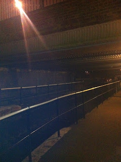
The photos above are image of one of our locations were we will be filming. This location is
Warwick avenue
canal in central London we chose this location because in the song there is reference to a canal so we decided to set our main scene here in Warwick Avenue canal also there is much space and different areas were we could film.this location is very close to Camden town Lock were this song is set, we also chose this location as it has parts under the bridge were it is very dark and dirty were we think it would be a good place were the camden ripper would of killed Suzanne and maybe his other victims.

Friday, 4 March 2011

Music Video Story Board

Below are images and writing from our first idea for our music video